Links and Articles Worth Reading
How To Get More Business From Your Website

Part 2
Getting Them To Stay On Your Site
If you know you have major problems with your website design and content - then do this first!
Busy? You can also download the full PDF guide here:

Get potential customers to find you, stay on your site, and take action.
Free PDF Download
This is a 3 part Guide to getting more business from your website.
Part 1 - Getting Your Customers To Find You
A - Organic Reach & SEO
B - Paid Advertising & Promotion
Part 2 - Getting Them To Stay On Your Site
A - Look and Feel
B - User Experience
C - Trust & Credibility
Part 3 - Getting Them To Click Through
A - Social Proof
B - Free Info
C - CTA Buttons
D - Expectations
A. Look & Feel
 Logo & USP - Keep it simple and in a common sense order. Keep your logo and Unique Selling Point/Proposition at the top of the page. Your USP should explain what your company does in clear and concise text. That way, your visitors know that they are in the right place immediately.
Not that I want to take you down a rabbit hole…but similar to a USP there is also a UVP, the tagline, and an elevator pitch. Whatever feels best to you, it needs to inform and inspire your visitors.
Content - Fact: People don’t want your product!…they want the end result… (eg. they’re not interested in the drill…they just need a hole!) sell the sizzle and don’t be pushy or salesy…it’s like a first date…think about how you want them to feel? Talk about the benefits, and the benefits of the benefits.
Bullet points work well…most people will be just scanning your site…they’re all busy! Write at least 300 words per page to keep both Google and your visitors happy. If your website visitors need to have more information, link to specific content rich background pages.
Up To Date - People know what an old site looks like…it looks like you may have retired and forgotten that it’s still live!..It also says that you’re not in touch with the current trends in your industry. Old website technology causes friction for your visitors, is more at risk of hacking, and can hinder your Google ranking.
Also remember that it is highly likely that your visitors are viewing your site on a small screen (depending on your industry)…have you ever tried to look at an old website on a mobile device?!?
Well Branded - Branding is not just your logo and your company colours…they're just a few elements of your brand. Your brand is who you are and what it is about your and/or your company that sets you apart from everyone else in the marketplace. It’s your story, your personality and uniqueness and your voice.
The way you present online needs to be professional, approachable, and relevant to your industry. Your brand needs to be consistent across all platforms including social, email, and advertising. It’s how your visitors remember you.
Engaging Design - Your home page needs to not only draw visitors further into your website visually, but also keep them mentally engaged…it needs to be interesting, and interactive. Like a roadmap, people enjoy knowing they are on the right path as they navigate though your information. Any mental or emotional friction will cause people to leave - eg. hard to find elements, illogical order or content, confusion of any sort.
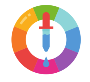
Colours - Colour psychology is a fascinating and serious field of study and it’s well worth some research so that you understand how it can affect your website’s traffic.
Here’s a good starting point:
https://neilpatel.com/blog/psychology-of-color-and-conversions/
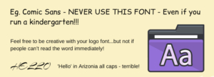
Fonts - Fancy fonts are lovely…but hard to read…and they become dated…some popular fonts can literally kill your professional image altogether!
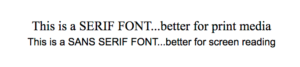
For page content the basic rule for comfortable screen reading is to make sure it’s a sans serif…serif fonts work better for print media…it’s all about the ease on your eyes…less friction!
And yep…there’s also ‘font psychology’…have a look:
https://www.nickkolenda.com/font-psychology/
Images - Be fresh, natural, relevant, colour coordinated and original. No gifs or flashing things…and no cheesy contrived, overused stock photos - stock photography can be great but you have to be discerning…using your own professional photos is even better.
Make sure you have the correct licensing for stock photos…and don’t ‘take’ images from other websites without asking. There’s a plethora of good free stock photo sites available. Here are our go-to sites for photos, video, and graphics:
Tool Tip: want images and graphics that fit with your colour scheme? Use Pexels, and search for your image topic, and in the far top right, choose a colour filter.
B. User Experience

Fast To Load - 1 in 4 visitors abandon a website that takes more than 4 seconds to load, 46% don't revisit a poorly performing website….and we’ve all done it…we couldn’t be bothered waiting when we can simply head to another site for the instant gratification we are used to. As mentioned in Part 1, cheap hosting, large images, bad code, too many plugins can all cause issues with site load times.
Layout - Navigation design choices can differ depending on whether the majority of your customers are on devices or computers…think about the user experience you prefer yourself when you are browsing on different sized screens.
Your content needs to be logically located and easy to find. Having Google analytics set up on your site will give you the stats you need to make the best design choices here. Otherwise, for most industries, assume that more than 50% of your visitors are on mobile devices.
Declutter - expanding on what we mentioned above…avoid the curse of knowledge! Arrange your content in common sense sections, with bullet points, small blocks of text mixed in with images and graphics, and intentional space… make sure your eyes like the flow of content from top to bottom.
C. Trust & Credibility
Business Details - People need to see your business details so they get an idea that you are a legitimate business and not somebody in Nigeria with unsavoury intentions. Your name, registered business name, ABN/ACN, address and phone number. Photos of you, your staff, and your premises also help people to feel safe.
Site Security and Safety - It’s is standard practice now for browsers to warn visitors if the site is not secure...ie. your SSL certificate. If you have not yet updated your site with SSL, you’re scaring people away…as mentioned in Part 1.
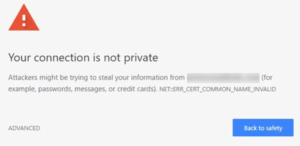
It’s almost impossible to get someone to come back to your site if they have had the experience of being given a ‘not secure’ warning from the browser because of a missing or invalid SSL Certificate.

Get potential customers to find you, stay on your site, and take action.
Free PDF Download